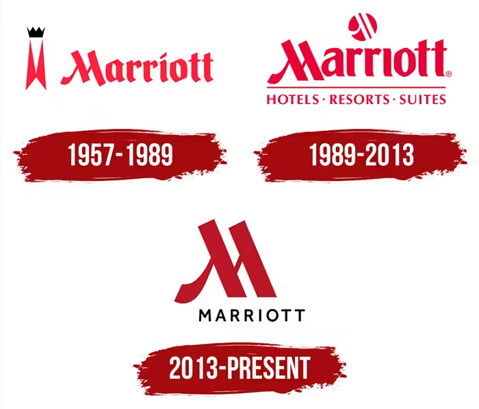
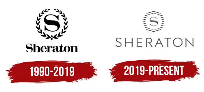
Hotel logo in the 1990s, the established international hotel groups like Hilton, Marriott, and Sheraton all exuded a strong “aristocratic” feeling.
Hilton logo use many complicated oval curves.
Marriott’s Logo is like a dignified family crest.
Sheraton directly used the laurel wreaths for decoration.
In the past, such designs gives quite high-end and exuded a strong sense to customers.
The strong sense of “European aristocratic hotels.”
This enables consumers to have a certain feeling just by seeing the LOGO-they have long history and stood for status and prestige.
However, entering the 21st century, the trend changed fast. The popular of mobile Internet has turned the “complex and exquisite” nature of logos into “difficult to recognize”.

The minimalist trend gained popularity in the 21st century.
Take the technology company Apple as an example. Its logo has gone from complex to simpler.

Minimalist design has spread to industrial design and graphic design.
There is one advantage of Minimalist design in logo. That is it will be see clearly in modern mobile devices.
For example smartphone, tablet, PC monitor.
If the logo too complicated, it can not see cleary on above screens.
Hotel logo is not as important as it used to be
Consumer Behavior now has become more Rational.
Rational means cunsumer will not decide buying a product or a service just by the feeling look the logo or appearance.
In the 1990s, business trips and travels were still in the minority.
Only a few people ever stay in hotels. A hotel logo that looks very classic and high-end can even attract many guests.
With the development of the aviation industry and globalization, more and more people are moving across regions.
In the past, staying in a hotel might have been a rare thing, but now it has become very common thing.
Consumers also have more choices. They will specifically compare factors such as hotel prices, locations, services, etc., and then make a decision.
Hotel LOGO is luxurious or not has become less important than before. The decisive factors have become the hotel’s decoration, service, etc
Marriott make big changes, cutting off the family crest Logo and leaving only a capital “M”, along with a straight font.

Sheraton make their logo looks more futurist.

The complex patterns and family emblems have instead become a burden. Young guests prefer a more relaxed atmosphere.
Global Consensus-Simplicity is deluxe
Excessive decoration (the hotel old logo)now often blurs the core.
It making one seem “overdone”, and thus loses the aesthetic composure and sophistication.

Simplicity doesn’t mean just simple. It has removed the complicated elements and only retained the most essential and core content.
So in hotel logo, the new simplicity will have a stronger impact than the old one.
What will Hotel Logos Become in the Next 10 years?
After observing the evolution over the past three decades, you might notice a strange matter: hotel Logo designers seem to be desperately trying to make the hotel logo “disappear themselves”.
In the 20 century, the hotels are afraid of that customer can not recognize it.
So they spent a lot of energy on design hotel logo. Decorate with more elements,use the weighing line font.
They make logo big, feeling old history and deluxe, that a big sign would be put up on the street saying “I’m here”.
However nowadays, the hotel logo seems to be shrunk to the smallest size.
It staying in a corner, as if saying, “Those who understand will naturally understand, and it doesn’t matter if they don’t.”
Behind this trend, in fact, the same force is at play:
-Firstly, the functionality of the Logo has been weakened. Under the repeated coverage of map navigation, OTA platforms and social media, consumers no longer rely on the storefront to find a hotel but on the screen of their mobile phones.
-Secondly, the brand’s symbolic sense is shifting. Today’s young people often remember a hotel not because of its Logo, but because of the light in the lobby.
They remember the handcrafted cup on the breakfast table, or a corner in the photos on their Moments, or an impressive hotel lock system.
So, in the next 10 years, hotel logos are very likely to become more “transparent”.
Perhaps it is just a minimalist line of text, or perhaps it simply takes a back seat,
The hotel space and experience will become the symbo of the hotel.
It is even happen that in the future, some new-style hotels will simply abandon their logos and replace them with a hashtag, a symbol, or a piece of digital code.
This sounds a bit crazy.
But when you think about it: Do you really still remember what the Logo of the hotel you stayed at last time? lStill only remember the scent of the incense in the lobby and the smart toilet in the washroom?


